This blog post is part 2 of a 3-part series about how we built a data platform from scratch at Collectors. It is part memoir, part instructional manual for data teams embarking on a “build a data platform” journey. Most of it is based on facts. All of it is based on my own personal experience and opinions. In case you missed it, check out part 1 here.
Iterate and refine
Getting this initial end-to-end pipeline off the ground was absolutely crucial for me to iron out any issues with the workflow and tooling. Questions like best practices for BigQuery service accounts for personal laptops and SaaS products, user permissions for all tools, how to handle data source access in Tableau, Stitch scheduling, these all came to light very quickly as I was building this proof-of-concept. I also documented every step of the process along the way in a Google Doc in order to make sure that I or other people could repeat the steps if necessary, and to explain the design choices I made in case we ever wonder why we did something in this weird and inconvenient way a few months down the road. Pro tip: Whatever you do, keep an open doc and write down a running monolog of what you do, type, or click, and why. Then make sure that doc is in a shared location. You’ll thank yourself later.
One major issue I ran into early one was the key-based incremental replication in Stitch. The following paragraph will be fairly detailed tech nerdery, but please bear with me. For those not familiar with the technique: Many ETL tools allow you to sync data incrementally, meaning that instead of copying an entire table over at each data pull, the tool uses an indicator of which records are new compared to the latest pull, and only syncs over those. This is a great way to reduce the time required for a data sync substantially, and in the case of large tables is absolutely critical to allow even daily syncs.
Now, here’s the crux: Incremental syncs in an ETL tool require a field that indicates some kind of “last updated” date or “rowversion” in order to tell when records have been updated. That way, the tool can keep track of the latest “last updated” value it synced and, at the next sync, only look at records that are “newer” than that date, to identify which records were newly added, and which ones were modified. Unfortunately, many of the tables in our production databases did not have such a field, meaning they were simply updated without any indication of when they changed. This required me to work with the database admin team once again to add a rowversion field to all relevant tables, which resulted in some production system downtime. Once that was done, I found that the datatype was a Microsoft SQL Server “rowversion” binary type that Stitch cannot handle. In order to deal with this, I created SQL views that simply select all fields from the table, as well as add a field with a type cast of the rowversion to a BIGINT type. We would then select these views for replication in Stitch instead of the base tables. At the time of writing this, these view definitions are checked into our data platform repo, but are only manually run whenever we modify the view, which is obviously not ideal. In the long term, these should be part of our nightly pipeline runs, with the view creation running right before our extracts are triggered. That way we could ensure that we always pull from the latest version of the views, and reduce the risk of accidentally using an outdated definition.
While the previous paragraph might have been mostly relevant for folks that actually use Stitch, the key takeaway is really this: Expect to pivot. Occasionally, you’ll have to come up with workarounds and creative solutions and coordinate across teams to get things done. Bonus takeaway: Database admins are some of the nicest and most helpful people I’ve had the pleasure of working with in my career, make friends with them!
The only good data is valid data
The rowversion change led directly to another critical exercise in the “build a data platform” journey: Data validation. Since we were partially replacing an existing data reporting platform, it was critical for us to ensure that the numbers we produced matched those in the existing platform, and that any differences were at least explainable and justifiable to our users. There were two main reasons why our data could look different: Either the data wasn’t correctly replicated, or our logic was different – or both! In order to graduate our initial dashboards from “prototype” to “production”, we spent a couple of sprints working through all base tables to compare them between the production databases and our replicas, then the analytical tables.
We started out doing most of the validation work in Jupyter notebooks, since these would allow us to easily connect to the different database backends and compare the results in Pandas dataframes. We quickly switched over to Hex, a web-based notebook style data workspace, as it provided us with much needed collaboration capabilities and a straightforward Google Docs-style version history. Once we were confident that the data matched and had identified where and why we had mismatches, we added an entry to the data dictionary page on our internal wiki and marked the data set as validated. This data dictionary functions as the source of truth for what kind of data content is available to users in the form of data sets and dashboards, and to give them an idea of the state the data is in: Red means we haven’t even started looking at the data, yellow indicates that there is an initial integration that may not be validated yet and not have any actual usable content, and green data sets are validated and ready to be used.
Final pipeline, v1
To wrap up this part of the blog post series, I figured you might want to see what our current data pipeline looks like. I’ve drawn out a high-level diagram of the pipeline below, starting with our source data and ending with Tableau dashboards that are accessible by our data stakeholders.
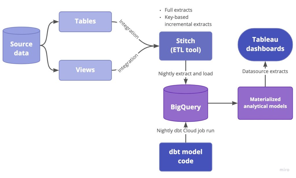
Now, in case you’re familiar with the modern data stack type tools, you may be wondering how we handled workflow orchestration. Our pipelines extract data on a nightly basis, replicate it to the data warehouse, then dbt kicks off and refreshes the analytics tables which are used for our Tableau dashboards. Surely we’d need some way to chain all these steps together and make sure step B only starts off after step A completes? Well, here’s a not-so-secret confession: In order to get started quickly, we’re simply running everything on a schedule with generous buffer times. This means that our Stitch extracts kick off at 1am PST every day and run for roughly 20 minutes, then dbt Cloud job gets triggered at 3am PST and runs for 15 minutes, and the Tableau dashboard extracts are refreshed 30 minutes later. Is this perfect and robust against possible disruptions? Absolutely not. Does it work for a “work in progress” data platform and reduce the need to manage yet another piece of infrastructure which may come with its own issues and glitches? Yes, it is, and at the same time we already have concrete plans to evaluate and implement a workflow orchestrator in the near future. Am I a skeptic when it comes to premature optimization? How could you tell!
This was part 2 our our 3-part series on building a data platform at Collectors. In the final part, we’ll cover how we worked with stakeholders across the organization to onboard them onto the data platform.
We’re hiring at Collectors! We’ve got open roles on the Data Platform team and many other teams: careers.collectors.com


